Crafting the Perfect Hunting logo: Behind the Design
Designing a logo is more than just arranging shapes and colors; it’s about capturing the essence of a brand, its story, and its audience. When it comes to creating a logo for a hunting brand, the stakes are even higher. Hunting is a tradition rooted in heritage, skill, and a deep connection to nature, and the logo must embody all of that. Let’s take you behind the scenes of how a hunting logo comes to life, from concept to completion.
Understanding the Brand
The first step in creating any logo is understanding the brand it represents. For a hunting company, this means delving into its mission, target audience, and unique offerings. Is the brand focused on traditional hunting gear, or does it cater to modern-day hunters with advanced technology? Perhaps it’s an outfitter for outdoor adventures or a conservation organization?
Once the brand’s core identity is clear, the design process begins with these foundational questions:
- Who is the target audience? (e.g., recreational hunters, professionals, or wildlife enthusiasts)
- What emotions or values should the logo evoke? (e.g., strength, precision, respect for nature)
- What’s the story the brand wants to tell?
Drawing Inspiration from Nature
Nature is at the heart of hunting, so it’s no surprise that many hunting logos incorporate natural elements. From powerful animals like deer, elk, and bears to tools like bows, arrows, and rifles, these symbols connect the logo to the outdoors.
For this logo, inspiration was drawn from:
- Wildlife: Using iconic animals such as deer and wolves to symbolize agility and strength.
- Landscapes: Silhouettes of forests, mountains, or plains to evoke a sense of wilderness.
- Hunting Equipment: Arrows or antlers subtly integrated to reflect the craft of hunting.
Sketching the Concepts
Once the research and brainstorming phase is complete, it’s time to sketch. This is where creativity takes center stage. Rough pencil sketches allow the designer to explore multiple ideas quickly. The focus here is on:
- Shapes: Ensuring the design is visually balanced and clean.
- Iconography: Playing with animal forms, tools, or typography to create a distinct mark.
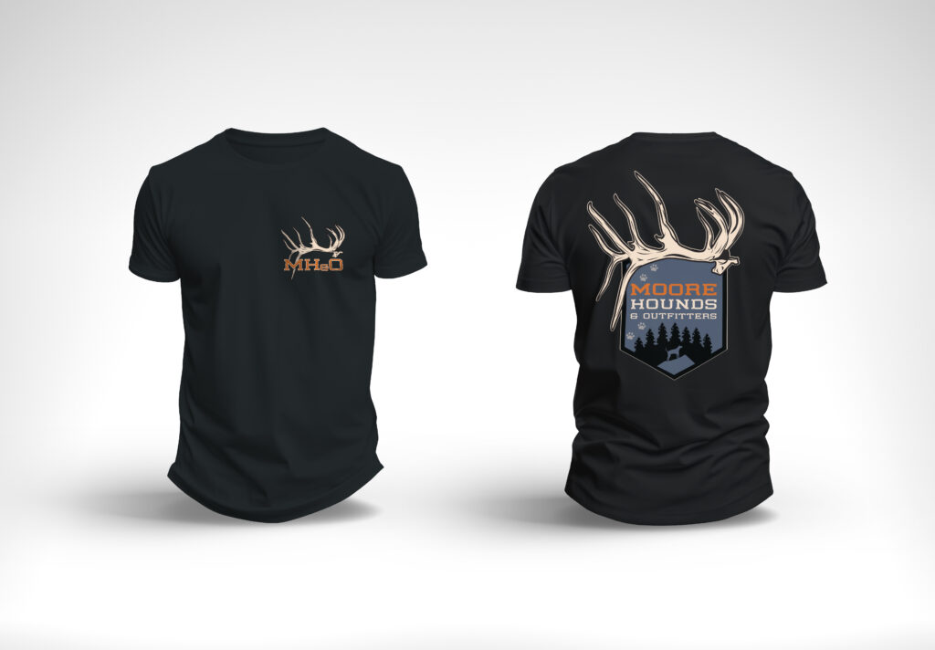
- Versatility: Considering how the logo will look on different surfaces, from apparel to digital platforms.
For the hunting logo, three initial concepts were created:
- A deer’s head in profile with sharp, geometric lines, emphasizing strength and focus.
- A circular emblem featuring a mountain backdrop, crossed arrows, and a hawk in flight.
- A minimalist antler design paired with bold, modern typography

Choosing the Color Palette
The right color palette can make or break a logo. For hunting brands, earthy tones often dominate: deep greens, browns, blacks, and muted oranges. These colors reflect the natural world and create a rugged, authentic feel.
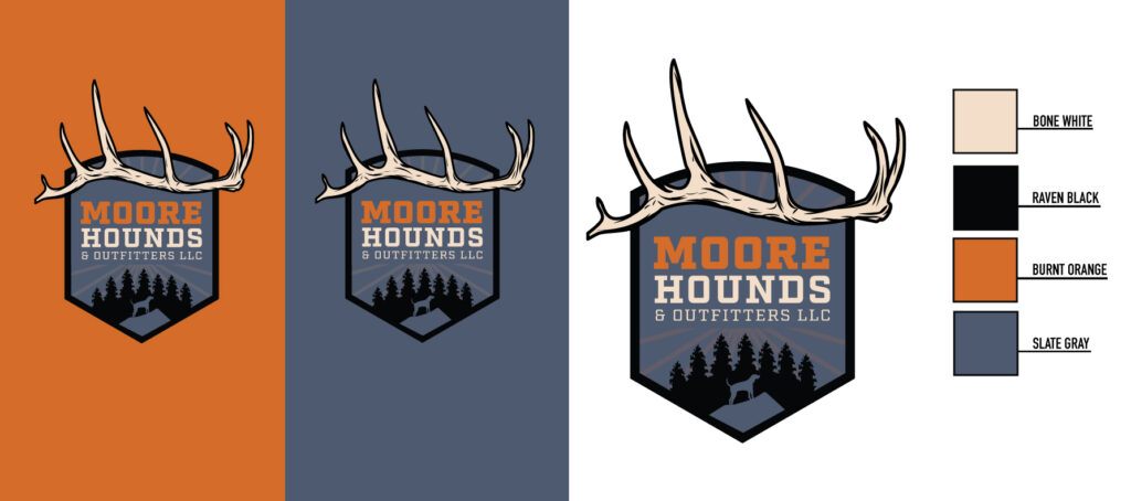
For this design, the chosen palette consisted of:
- Bone white:Representing bone.
- Burnt orange:Symbolizing the earth and tradition.
- Raven Black:Adding boldness and contrast.
- Slate Gray:A subtle nod to success and premium quality.
Refining the Design
After gathering feedback on the initial sketches, the most promising concept is selected for refinement. This involves:
- Adjusting proportions to ensure harmony.
- Fine-tuning details to enhance clarity and impact.
- Testing the logo in black and white to ensure it’s effective without color.
In this case, the deer’s head concept was selected, but the antlers were stylized into a subtle “V” shape to hint at victory and precision. The typography was chosen to complement the sharp lines of the icon, with a clean sans-serif font for modernity.


